Web Components
Use to embed custom dashboards, workflows and integrations.
Introduction
Web Components come into the picture when you're looking to extend Facets with tools tailored to your team's specific needs. Instead of switching between different tools and dashboards, you can now embed your own web apps directly into Facets.cloud, creating a more unified experience for you and your team — all in one place.
- Your Web Components render inside their own shadow DOM, so they won’t mess with Facets’ styles or behavior.
- They inherit the active session token, so you can make secure, authenticated API calls just like any native part of the platform.
- Create context-aware components that inherit user roles and resource data and reduce context-switching.
- And since all Facets APIs are available via Swagger, it’s super easy to hook into environment provisioning, workflow triggers, or anything else you need — making your custom tools feel like a natural part of the platform.
With Web Components, you get flexibility without fragmentation. Everything stays connected, consistent, and developer-friendly.
Guide
There are two ways to develop and deploy a web component in Facets: you can either manually build it by following the guidelines in the developer guide, or use Praxis to automatically generate and deploy the web component with minimal effort.
Manual Guide
| Manual Guide | Description |
|---|---|
| Sample Web Component | Quick-start example with minimal code |
| Developer Guide | Web Component architecture, lifecycle, patterns, and full working example |
| API Integration Guide | Authentication model, making API calls, user context, and navigation bridge |
| Deployment Guide | GitHub Pages deployment, CI/CD workflow, and registration |
| Testing Guide | Local testing, debugging with DevTools, and troubleshooting |
Prerequisites
Permission to register Web Component and familiarity with Web Components development.
Example of how to write a web-component : sample-web-component
Creating Your First Web Component
- Navigate to Organizational Settings from left sidebar.
- Locate and click on the Web Component option.
- This will take you to the Web Component Listing page, where you can:
- View all existing Web Components.
- See component types, remoteURLs, and respective creators.
- Track which components are enabled or disabled.
- Delete components that are no longer needed.
Adding a Microfrontend Web Component
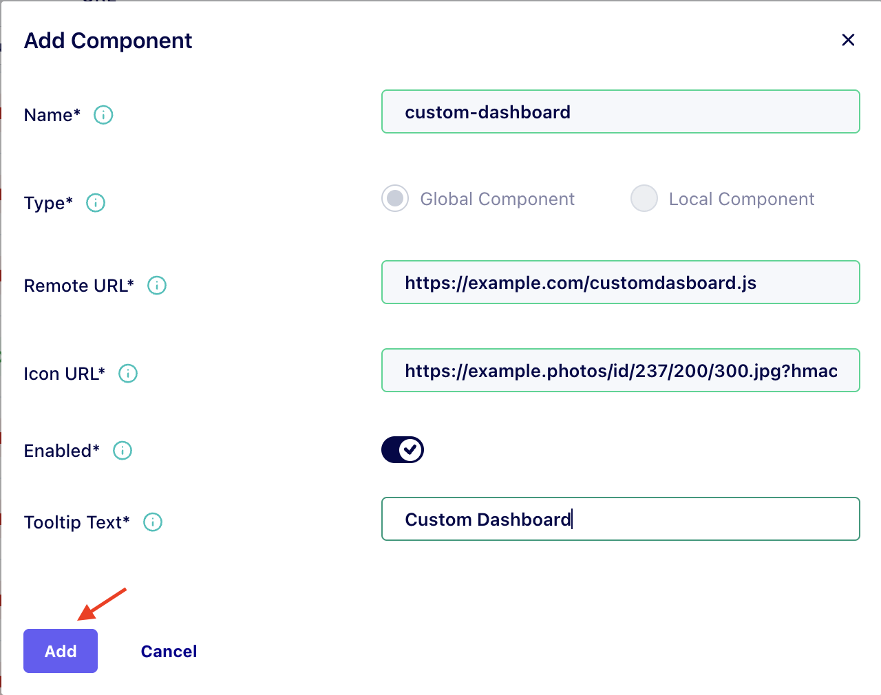
Click on the Add Component button. This will open a dialog where you can:
- Name: Enter the web-component name (e.g., If component is <custom-dashboard> then the name will be custom-dashboard)
- Remote URL: Provide the hosted url of your component script (referencing the .js file directly).
- Icon URL: Enter the URL for the icon to be displayed in the Facets UI for that component.
- Enabled: Toggle on to make the component immediately available after creation.
- Tooltip Text: For a brief description that appears when users hover over the component icon.
After filling in all required fields (marked with *), click the Add button to register your component.
Now Your new component will appear in the Sidebar below the Organization Setting button immediately after registration, ready to be accessed by your team members.
To Disable components
- Navigate to the Web Components Dashboard.
- Locate the component you wish to disable.
- Click edit and toggle the Enabled field to disable and Save,
To Delete components
- Navigate to the Web Components Dashboard.
- Locate the component you wish to delete.
- Click the Delete button and Confirm deletion when prompted.
See it in Action
Component Development Guidelines
Your Web Component must:
- Extend
HTMLElementand register withcustomElements.define('your-name', YourClass). - Use Shadow DOM (
this.attachShadow({ mode: 'open' })) to isolate styles and prevent conflicts with the platform UI. - Handle contextual data passed as HTML attributes (e.g.,
userattribute contains JSON user data). - Be self-contained in a single
.jsfile with no external dependencies or build step. - Use relative API URLs (
/cc-ui/v1/...) -- the session cookie is inherited automatically.
Facets passes contextual data to your components:
- Sidebar Apps (
NAV_APP): User data is passed via theuserattribute as a JSON string. Parse it withJSON.parse(this.getAttribute('user')). - Custom contextual attributes: Any key-value pairs set in
contextualAttributesduring registration are passed as HTML attributes.
For a complete guide to building production-ready components, see the Developer Guide. For API integration details, see the API Integration Guide.
Updated about 2 months ago